benni
Redesigning the Benni benifits website, to bring the user into focus and drive the business forwards
Benni
Website Redesign
My role:
UX/ UI digital designer
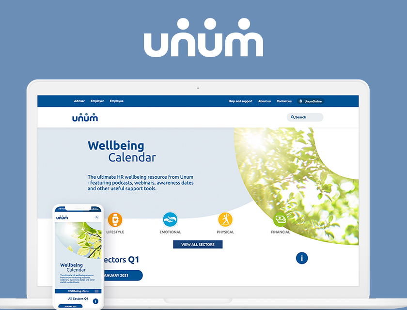
Company:
Unum
Tools:
Photoshop, Sketch, Zeplin, HotJar, Google Analytics
Year/ Duration:
2019 / 1 months
About benni
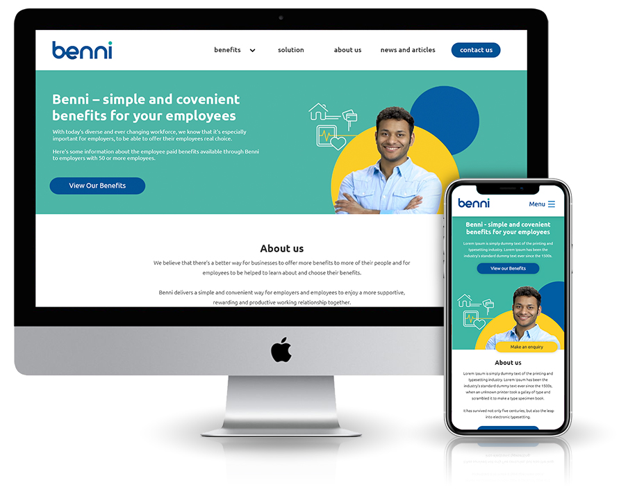
Benni want to transform the way businesses provide workplace benefits. They believe that there’s a better way for businesses to offer more benefits to more of their people and for employees to be helped to learn about and choose their benefits. The challenge is to update the website making it upbeat and eye-catching.

User Research
Homepage Scroll Map – Desktop
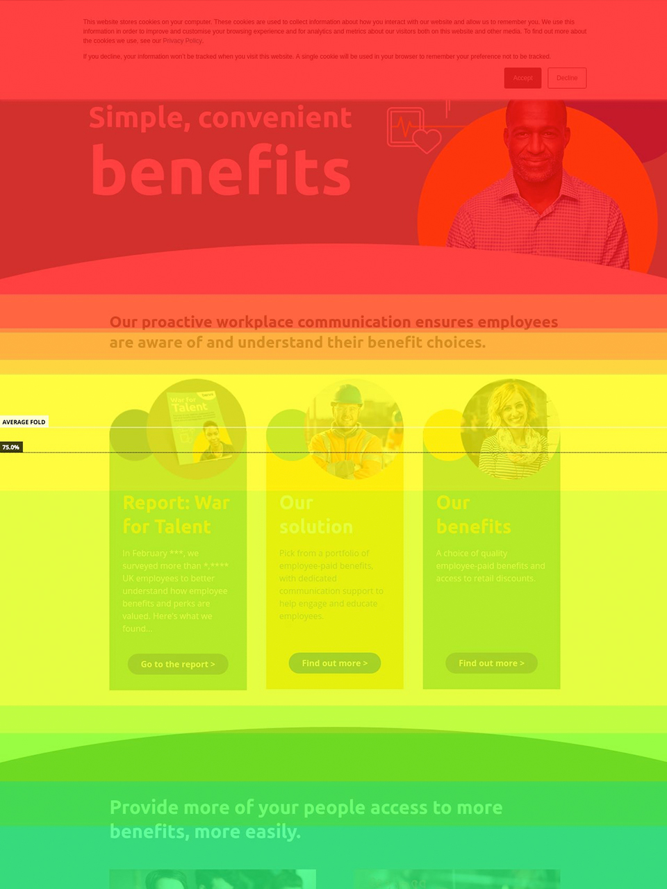
Using Hotjar I can see the heat map for the current Benni page. As you can see the section that is seen the most is the top section then the future do down the page you go the lower the customer attention is.
As you can see here there is no calls to action in the hero section. The navigation links are the only buttons, which the customers can click on.
The “make an enquiry” form Benni is at the bottom of the page, on desktop top the engagement of this section is only 30% and on mobile it is 10%. Customers are not viewing the form; this is probably why Benni does not have many leads.
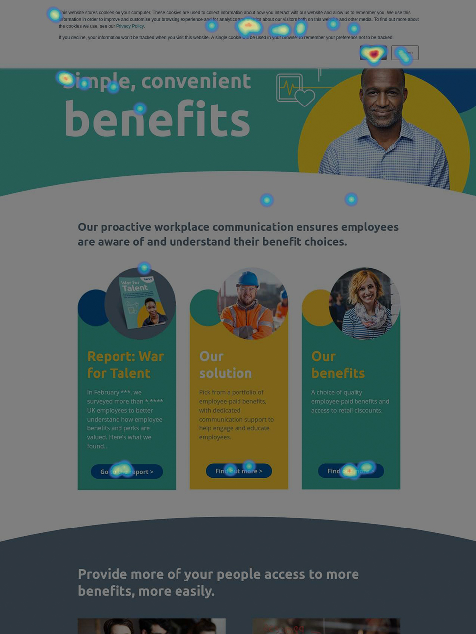
Homepage Scroll Map – Mobile
On the mobile version of the home page, the text is different sizes, which is not best practice.
The engagement of the site drops to 40% after the fold and then a further 90% before the customer gets to the “make an enquiry” form. It would be a wise decision to move the form higher in the page so that more customers see the form.
UI kit
Following the Style Guide, I crafted a UI Kit that would inform the Design System for Benni.
Logo
Icons
Colour Palette
Benni KPI’s
- Making it easier for the customer to contact benni
- Inform Customers about the different solutions
- Inform customers about news and articles
Information Architecture
Defining imagery

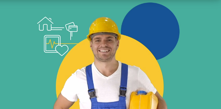


The current hero banners are currently broken and they do not look professional. With still images that are cut half way, this is very distracting when you view the page on other devices.
I have an animated hero would bring life to the pages. I decided not to have the animation constantly looping, as this might no look professional.
Each page also has its own character which is diverse not only in race but in profession. This indicates to the customer that Benni is for everyone.
More UX projects